Food & consumer goods
FAREEDA DRIED FRUIT
Rooted in heritage. Ready for a new generation.
( THE BRIEF )
Refresh a long-standing premium dried-fruit brand while preserving decades of trust. FAREEDA needed a coherent identity that could express its heritage and warmth across modern retail, packaging and digital channels.
( THE DESIGN CONCEPT )
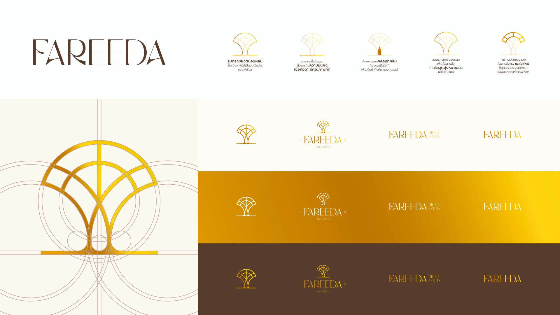
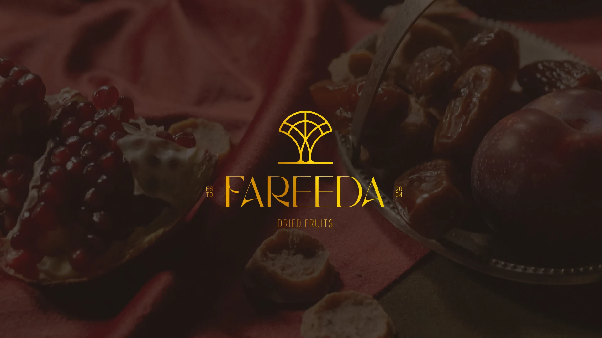
The date palm tree anchors an identity built around origin, growth and care. Earthy browns, golden tones, refined typography and natural graphic forms bring warmth and premium clarity to a flexible brand system.
( SCOPE OF WORK )
- Brand repositioning
- Logo & visual identity
- Brand voice
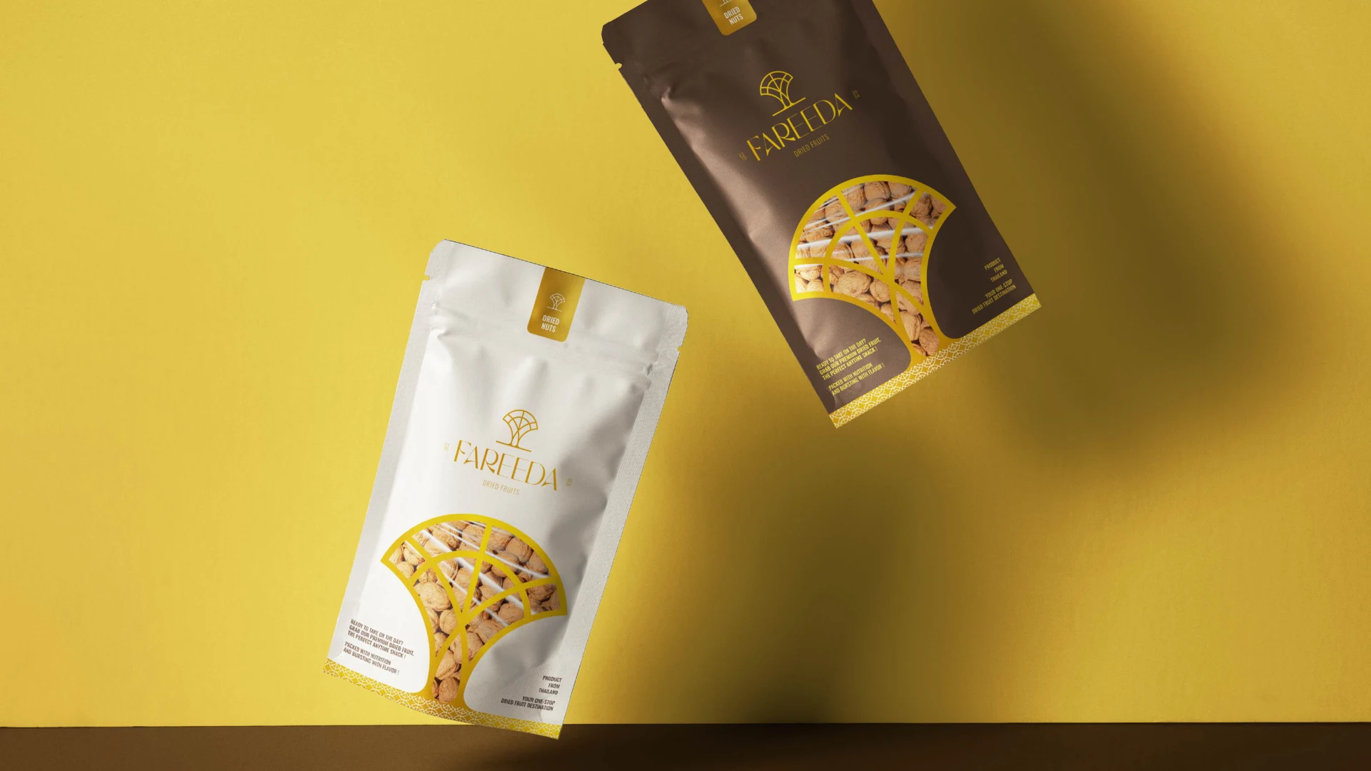
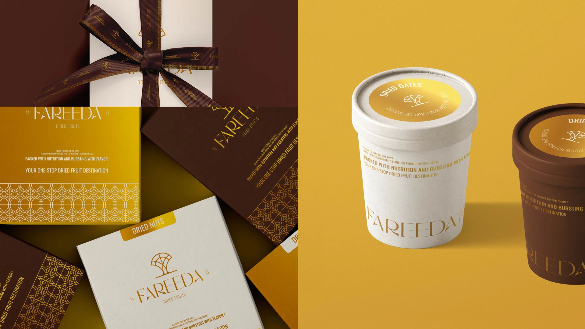
- Packaging system
- Digital templates
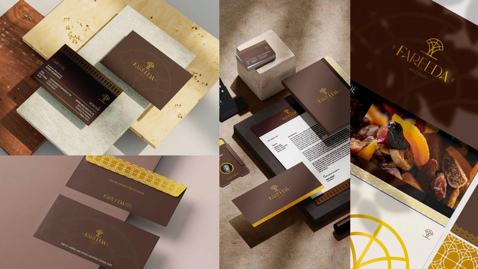
- Merchandise & internal touchpoints